If you haven’t already noticed, the web is going high-def. From bombastic background images to nifty UI elements, HD design is quickly becoming commonplace.
The shift actually began a couple of years ago, due to the emergence of retina screen technology, but faster connections have also emphasised the change – allowing for greater access to high definition sites from any device.
In fact, many of the devices on the market today have high definition displays, and the reality is that even if you have a device without a HD display, having a high definition website won’t hurt.
Are you thinking about refreshing your site with a HD design? Here are a few things to consider:
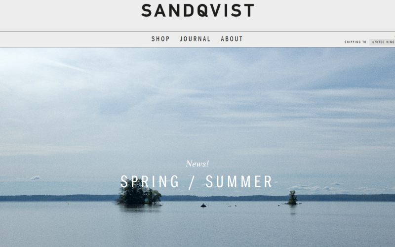
The first thing you should be thinking about when it comes to HD design is images. The days of saving every image hosted on your website at 72ppi are over. That just won’t cut it on today’s screens. The standard for HD is 200ppi – more than double what you might have been saving at previously. The most common screen size now is 1024×768 pixels or higher, with more than 30% of users working on a high definition screen.
The same can be said for smaller screens too. The iPhone 6s (401ppi) and Samsung Galaxy S7 (577ppi) both boast HD capability.
So, when it comes to images, they have to be sharp. You won’t get away with blurry or pixelated images. Saving at the old standard resolution will leave your design looking flat, whilst high resolution images will appear far more polished. The downside to using this type of image is speed; higher quality tends to equal longer load times. You should save as close to spec as you possibly can and don’t overload files.
Video (in particular the interactive kind) is the must-have design trend for 2016, and just like with images, videos need to be of a high quality.
When it comes to illustrations and backgrounds, HD matters here as well. Remember that every little detail is visible in high definition, so you need to make sure that every part of your site’s design contributes to the overall aesthetic.
We craft designs that are pixel perfect. How do we do this? By focusing on simplicity.
When it comes to the icons and UI elements on your website, you need to be aware of SVG and CSS. And all of these elements will likely be classified as one of these two types.
SVG, or scalable vector graphics, are essential on the web. We use SVG to save shapes, icons and other UI elements. CSS elements are pure code and will scale and style with the design.
SVG and CSS elements move with your site, which is why you need to on board with the responsive design framework. Nothing will dent your site’s UX quicker than a flurry of pixelated buttons.
HD design will set your site apart from the crowd. Users expect an HD experience, and your site needs to meet those expectations.
The good news is that you can make changes on the path to getting there.
Comments are closed here.