Late last year, Google shook the industry by switching up its search algorithm to favour mobile-friendly sites. A fairly self-explanatory term, ‘mobile-friendly’ refers to a website that performs as intended on a mobile device.
The move was a natural response to the shift in browsing preferences, which are increasingly moving toward mobile. In an uncharacteristic move, Google let everyone know about the update nearly two months ahead of time, even including tips for increased compatibility: avoiding Flash, ensuring that text is sized appropriately, placing links and buttons far enough apart to accommodate the user etc.
Whilst it’s clear what exactly constitutes a mobile-friendly site, there’s still confusion around what makes a mobile-friendly site different from a responsive site, and what makes that different from an adaptive site.
Mobile-friendly vs. Responsive
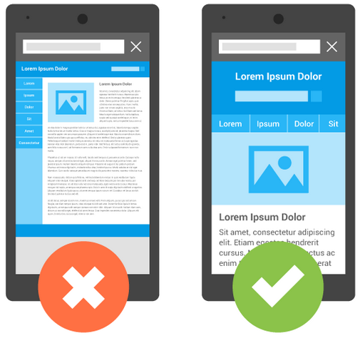
Mobile-friendly sites aren’t necessarily designed specifically for use on a mobile device. They tend to be variations of sites that work across different devices. Think of a mobile-friendly site as mobile-optimised, whereas a responsive site is mobile-first.
A responsive site reacts to the device it is viewed on. For example, a desktop site may have a multi-column layout, which a mobile-friendly site may have on a smaller scale so users can see everything without having to scroll. But a responsive site will have a single-column layout that translates better to a smaller screen.
Responsive sites have many of the same characteristics that make a site mobile-friendly, but they differ in key ways. They are reliant on mobile operating systems, in addition to having dynamic content that changes depending on how it’s viewed.
In other words, every responsive site is mobile-friendly, but not every mobile site is responsive.
Responsive vs. Adaptive
In this case, both variants are similar in theory, but different in practice – both change their dimensions based on the browser and device they’re being viewed on.
Adaptive sites adapt at select points. Webmasters ensure that the browser is a certain width, and the content should then snap into place, rather than change sizes. In effect, an adaptive website has several different layouts, which can be deployed based on the size of the browser.
Which is best for me?
At this point, everyone should have a mobile-friendly site. Not everyone necessarily needs a site that’s mobile adaptive or responsive, but you should look into it if a significant portion of your traffic comes from mobile devices.
Generally speaking, adaptive is easier to deploy. If your site is complex, you should think about following the responsive route, particularly if you’re managing an e-commerce platform.
Comments are closed here.