Making the move to responsive design
The importance of ensuring your online platform is fully-optimised and ready to be viewed by the web’s many mobile users has never been so important. Earlier this week, Google finally pushed out its fourth major search algorithm update – a significant rollout that will place increased emphasis on a site’s mobile-usability, particularly its role as a key ranking factor.
Google’s decision to hone in on the mobile user experience is perhaps one of the biggest changes to their search algorithms in years, and one that you cannot afford to not take seriously. With mobile search growing at 10x the current rate of desktop, engaged businesses that have yet to fully convert to a mobile-friendly site could be facing a mammoth 33% drop in search traffic and plummeting viewability figures in the wake of the algorithm’s launch.
You may be wondering how exactly Google’s plucky algorithms will assess a site’s usability on mobile devices. The new algorithm will crawl each page on the site, check for lengthy load times, incorporated responsive design elements and mobile best practice. For now, searches made on tablets won’t be factored into this setup, but this is likely to be in the pipeline at Mountain View – so it’s worth getting ahead as soon as possible.
Google will be taking a closer look at the base mobile usability of sites on the web, assessing; how many clicks or taps it takes for the user to reach their desired location, for example. Should your site have a convoluted or complicated visible site structure, it will more than likely fail this part of the algorithm’s assessment, resulting in a delay in your site receiving the shiny new ‘Mobile-friendly’ tag on Google’s SERPs.
Whilst Google’s mobile algorithm pledges to scan every page on a site, it is worth noting that the algorithm is currently applied on a page-by-page basis, rather than capturing a generic snapshot of the entire site. This means that newly-published or amended pages will receive a search boost far quicker than before, thanks to the algorithm’s granular crawling routine. It may seem attractive to simply focus on one or two core functional pages and pray for a healthy ranking boost, and whilst this may work initially, your site is at Google’s mercy and attempting to bend the rules for benefits may result in a damaging search penalty.
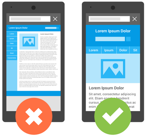
At this point, the core responsive factors to focus on are typography; ensuring any text is readable without zooming, content; all visual elements should re-size intuitively to provide a seamless user experience and spacing; ensure that any links are spaced apart so the user can click the links they require without making simple mistakes. Flash may also pose a significant problem, too, so if your mobile site is currently using Flash, Google may drop your site in the rankings for doing so.
Your customers demand responsive
In this fast-paced digital sphere, the average user no longer has the time, patience or inclination to pinch-to-zoom in order to render content to a viewable size on a mobile device. If they are forced to do this, due to an outdated site design or major compatibility issues, the chances are the user will simply tap back and visit another site instead. Therefore, you should now be looking to provide an effortlessly fluid and inherently viewable platform that complements a diverse range of devices, content forms and reading habits.
For those that are already on board with this instinctive approach to web design, the sales opportunities and potential for customer engagement are immense. SMBs that have already adopted a responsive design will now be reaping the financial and social rewards brought on by the added visual value and simplified customer experience.
Fortunately, the majority of businesses are beginning to wake up and modify their digital approach. However, there are still a large number of SMB owners who are more than aware that their platform attracts countless mobile visitors, but are still failing to act on this invaluable knowledge.
Research carried out by Bop Design, a B2B agency based in the US, revealed that:
• 34% of mobile users go online mostly using their phones, and not on a desktop, laptop, or other device.
• Users searching online using a mobile device will increase from 800 million to 1.9 billion in 2015. It is clear from this data that the general public has instinctive form for mobile browsing, and this appetite is unlikely to waver in the near future.
However, Bop Design’s research also showed that:
• 46% of those surveyed revealed that they had problems viewing a static site on a mobile device. A static site is a traditional, non-responsive website.
• 44% of those surveyed believed that on-site navigation was difficult on smaller devices.
The second set of figures become particularly prevalent if you allow yourself to view a static site from the perspective of your customers. Would you be willing to navigate across a site using a series of cumbersome drop-down menus or excessive links? Can the user get to where they need to be on the site with ease, and once there, can they view the page without having to take unnecessary steps to make the content viewable? At a base level, can the user revert back to previously viewed pages, or at the very least your homepage?
If the answer to any of those questions is “no,” then your approach to web design needs to change – quickly! In 2015, trying to cram a traditional desktop website into an mobile form is a unequivocal recipe for disaster and will lead to a difficult and unpleasant user experience for your customers.
Dive headfirst into a new design
The message, therefore, is abundantly clear: If you’re a business owner that chooses to work on optimising your businesses platform for the mobile surge, then you will not only be pleasing a considerable percentage of your existing consumer base, but you will also likely benefit from improved mobile SEO over your competitors that are still lagging behind.
It is now within almost every businesses best interest’s to adapt to responsive design, mobile devices and ensure that their site delivers a positive and comprehensive user experience. Should you fail to do so, you’re almost actively encouraging potential customers to abandon their search and look to your competitors to deliver whatever it is they’re looking for.
At the rapid rate at which mobile search is moving, you cannot afford to sit back and idly let customers pass you by. Google has issued a subtle warning to those yet to upgrade to a responsive design with its new mobile algorithm – so sit up, pay attention and join the responsive race today.
Comments are closed here.